F&G Case Study
For nearly 60 years, Fidelity & Guaranty Life has been a catalyst to help others plan for tomorrow. With 700,000 policyholders counting on their annuity and life insurance products, Fidelity & Guaranty was known as a trusted friend by many but was still relatively unknown to the general public.
They asked Siegelvision to help change that and let the world know why they were different.
“At F&G, we live our brand every day by collaborating with our distribution partners to help our policyholders plan for their future and achieve financial independence. Our new brand conveys the commitment we have demonstrated over the past 60 years to offering great products that help hundreds of thousands of Americans to achieve their hopes and dreams.”

New logoCHALLENGE
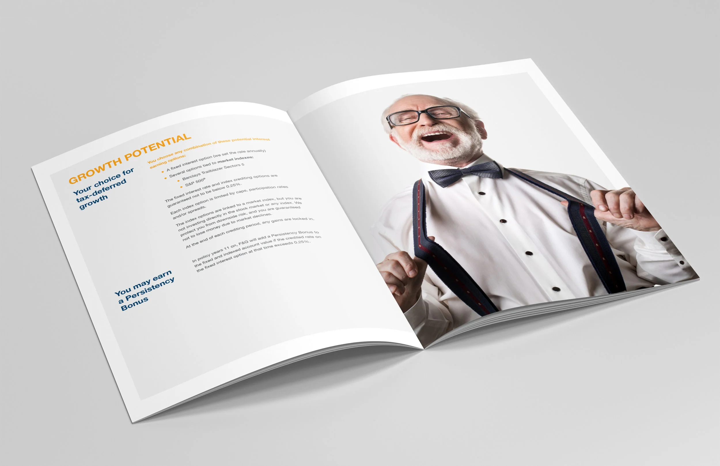
To demonstrate their truly empathetic approach to customers’ needs they asked Siegelvision’s Simplification Team to streamline and simplify their sales materials and customer product brochures to synthesize information and use plain English to make it easier for people to make informed decisions.
As our Simplification Team clarified their documents, our Strategists dug into the research.
In research we learned that their name was blurring their identity. They were being confused with other financial firms named Fidelity. A new name was in order. The A-HA! moment was when we discovered that their greatest strength was their unusually eager willingness to collaborate with insurance agents and financial advisors to create innovative new products personalized to their customers’ needs.
SOLUTION
“We are positioning F&G for the future by building on our core strengths. Through our research, distribution partners told us how they value our collaboration with them to offer effective solutions for clients. Our new brand reflects this differentiation by being bold, clear and confident in the crowded and confusing insurance marketplace.”
Unusually collaborative, this insight was the catalyst for all of our work. It led to their new tagline:

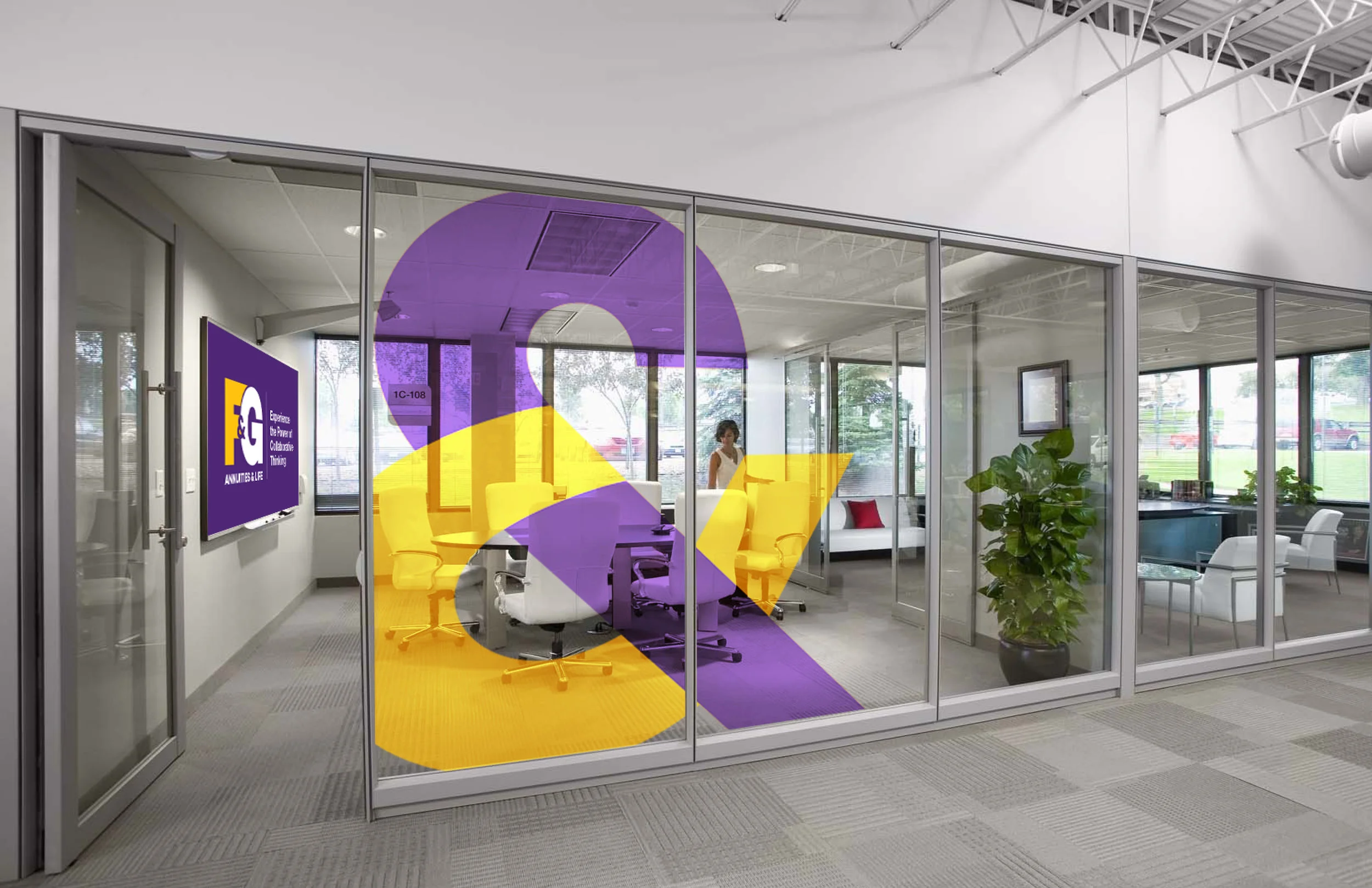
New taglineIt informed the design of their new logo; we simplified their name to F&G, with the F hugging the G and an ampersand (the true symbol of collaboration) tying the two initials together. Complimentary colors purple and yellow were selected to give the logo importance and energy, and helped differentiate the organization from the sea of blue being used by competitors. In our print ads we focused on their new brand’s ampersand.


Click to enlarge workThen we created a fun, colorful, upbeat film to launch the rebrand. It featured an animated brand ampersand and showed things that work well together like, well, peanut butter & jelly.

Click & watch movieWe designed the website and gave them an upbeat and vibrant look and feel. We also simplified and designed marketing collaterals including all of the product brochures.


Click to enlarge workIMPACT
“Today’s brand launch marks a significant milestone and the next phase of an exciting journey for F&G and our customers.”
Siegelvision is proud to help F&G shake up the usually staid annuities and insurance biz with a bold new identity. And we’re happy to say the research was no lie, they truly are wonderful people to work alongside. Some things really work well together – like Siegelvision & F&G.