WOMANKIND Case Study
WOMANKIND, formerly known as NYAWC is a 501 (c) 3 charitable organization founded in 1982 by a small group of volunteers from the Asian community. They offered intensive counseling and advocacy assistance to battered women and their children.

CHALLENGE
The New York Asian Women’s Center, one of the City’s most effective domestic violence support organizations, came to us to rejuvenate their brand, broaden their appeal and attract new donors. They told us that “New York” in their name was limiting their national fundraising efforts, their client base was no longer limited to the Asian community, and they were so much more than a tiny storefront “center.” Obviously, they were in need of a name change.
SOLUTION
We created a name worthy of an important, national organization: WOMANKIND. It not only raised the profile of the organization, it gave them an immediate global relevance. We refined their purpose to: Guiding women from a world of hurt to one of kindness.
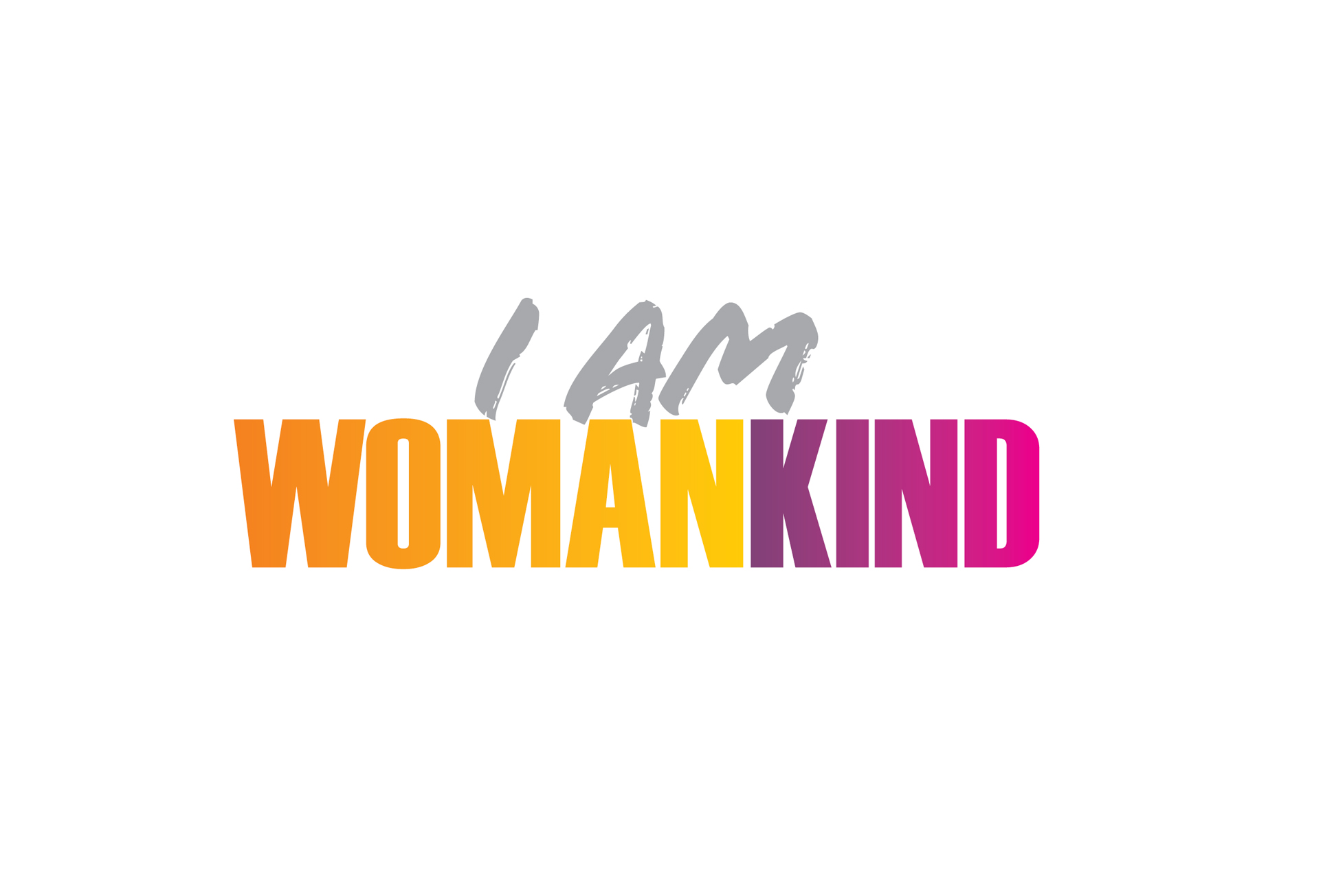
We gave them a new logo and opted for a new typeface, inspired by Beyoncé, a strong, bold, powerful woman. Their new color palette includes gradients of yellow and orange, which represent ‘hope,’ as well as purple, the universal color representing domestic violence.
Their old logo contained a phoenix. We de-emphasized that as a visual element but paid homage to it in the new tagline we created for them:
WOMANKIND
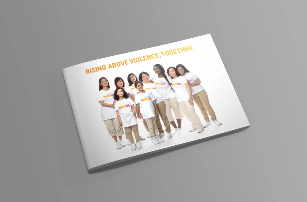
RISING ABOVE VIOLENCE
We developed a bold, inspiring new look and feel for their website.


Click on images to view our work
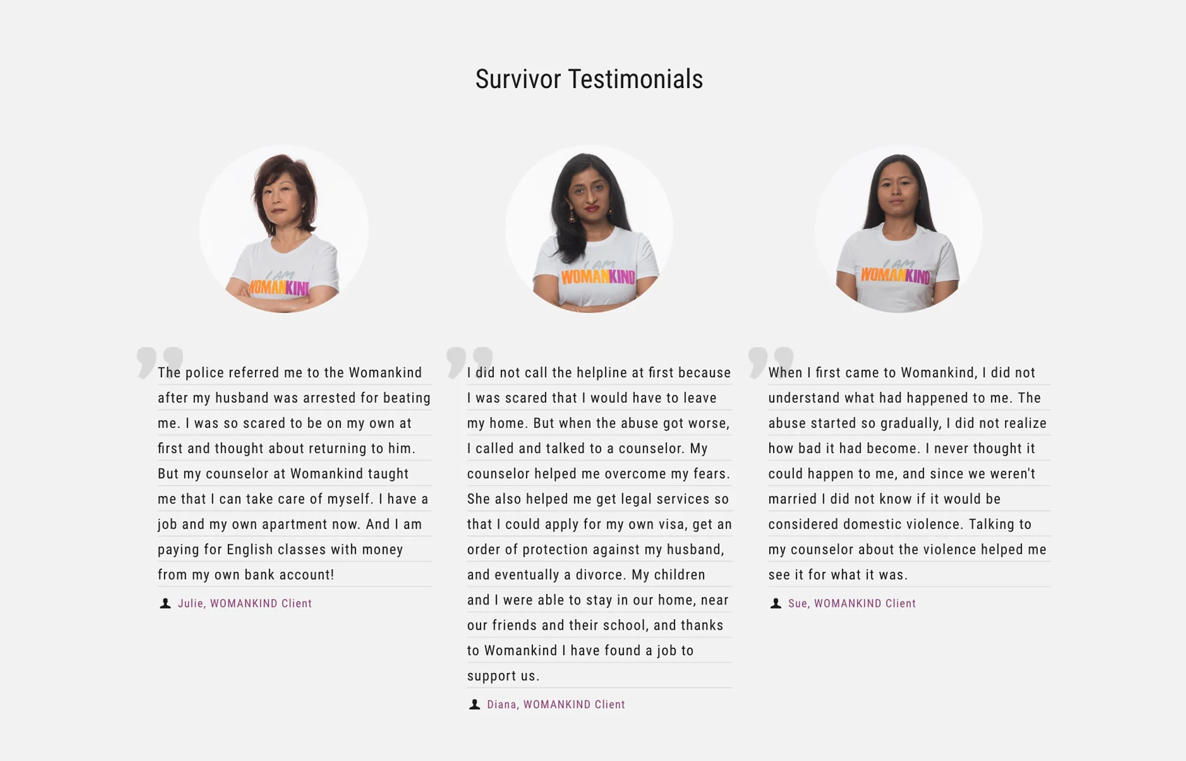
And to raise awareness of WOMANKIND’s newly clarified identity, Siegelvision created the “I AM WOMANKIND” campaign. Our photo-shoots included people of all genders, nationalities and identities, looking straight into the camera as a declaration of their independence and power. They wore newly designed t-shirts to further spread the message, In the wake of recent elections, WOMANKIND t-shirts have been put to good use, adorning activists at events across the country.
IMPACT
The organization’s staff, donors and clients have eagerly embraced the new identity. Last year, after the organization unveiled its new identity, Womankind raised a record breaking amount of money, the highest ever in the 35-year history of the organization.
WOMANKIND’s new identity has given them renewed vigor in their battle to help women rise above violence.
Siegelvision was proud to help this amazing organization help the victims of gender violence to find refuge, recovery and renewal.
SERVICES WE PROVIDED
Brand Strategy
Brand Positioning
Brand Purpose
Brand Voice
Visual Identity
Photography
Brochure
Website Concepts
“The rebranding allowed people to see our agency as being innovative in a different sense - being a difference maker. We are finding better ways to help survivors of violence and abuse.
Womankind has values and speaks of empathy, non-violence, and compassion.
We changed our name to reflect these qualities and changed our brand because in the last few years the agency has changed greatly.”